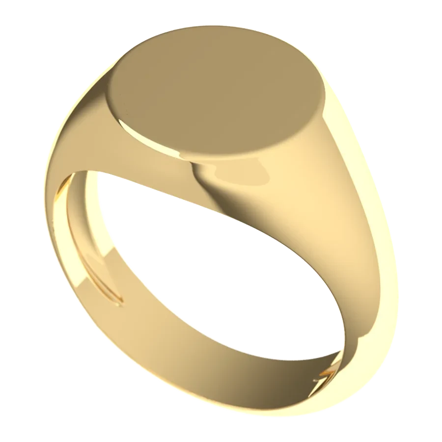
Monogram Signet Rings: How to Pick Letters and Layout
Why a Monogram Signet Ring Matters
A signet ring started life as a tool. The flat face was engraved so its owner could press a mark into soft wax and close a letter or a document, and the mark stood in for a signature. If you want the longer story, the Wikipedia entry on signet rings covers the ancient seals and how they moved from the desk to the hand.
A monogram is the simplest personal mark you can put on one. It is a design built from letters, usually the initials of a name, combined or arranged into a single symbol. The Monogram article on Wikipedia traces the idea back to coins and early seals, which is a neat fit: the same habit of reducing a name to a few strokes is what you're doing when you choose letters for a ring.
Why does it matter which letters and which layout? Because a signet face is small and it sits in plain view. A crest needs a story and a shield. A monogram has only the letters, so the proportions, the spacing and the letterform do all the work. Get them right and the ring looks calm and finished. Get them wrong and it reads like a luggage tag.
There's also the practical point that a monogram is the most flexible personal design. It doesn't depend on a family history, a coat of arms or a motto you have to explain. Anyone can have one, and it can carry your own initials, a shared pair for a marriage, or the initials of someone you want to remember. If you're curious about the crest route instead, our journal piece on family crest rings, from coat of arms to custom signet walks through it. And if you're not sure which finger the ring belongs on, read which hand and finger is traditionally correct before you size.
How to Choose Letters and Layout
Work in this order: whose letters, what order, which letterform, then which face shape. Doing it backwards (falling for a shape and then forcing letters into it) is how people end up redrawing their design three times.
Start with the initials. One, two and three letters are the practical range. A single letter is the boldest and the easiest to read. Two letters suit a couple or a first and last name. Three is the classic personal monogram, and it's where the rules start to matter.
The long-standing convention for a three-letter personal monogram is first initial on the left, surname initial in the center and larger, middle initial on the right. So for Anna Grace Whitfield you'd see A, W, G, with the W standing tall in the middle. That's the version most people recognize as traditional, and it looks balanced because the largest letter sits in the middle of the face. If all three letters are the same size, the convention flips: the order is simply first, middle, last, read left to right. Pick one system and stay with it, because a mix of the two confuses anyone reading the ring.
Next, the letterform. Here's a position I'll defend: for a ring face, choose a bold, simple letter with clear shapes. Block serif capitals read well at small size and look at home on gold. A serif typeface has those small finishing strokes on the ends of the letters, and they give each initial a little weight and a settled look. A flowing script is lovely when it's drawn for the purpose, but it works best with one or two letters and generous space around them. Ornate script with three letters and a border is where a face gets busy.
Then think about the reading direction. A signet that you'll wear is read the right way round on the finger. That's the usual approach, and it's what most monogram rings want. A ring meant for pressing wax is different, because the engraving has to be cut in reverse to print the right way round. That's a separate decision, and I'll come back to it in the buying section.
Finally, consider the space inside the face. A thin line border or a plain polished rim gives the letters room and frames them. Packing the letters edge to edge is the most common mistake. Leave a clear band of metal around the design and the letters look deliberate. Because Crest faces are laser-engraved, fine, crisp lines come out cleanly, so a delicate border or a small ornament between letters is well within reach if you want one.
One more choice that people forget: the metal tone. Yellow gold gives a traditional, warm look and contrast against shadowed letters. If you'd like something softer, browse the rose gold signet rings. Letters read well on both, so choose the tone you'll enjoy wearing rather than the one you think shows the engraving better.
Top Layouts and Face Shapes
Let's split this into two parts: how the letters are arranged, and what shape holds them.
Single initial. One large letter, centered, with plenty of space around it. It's the cleanest option and suits a small face as well as a large one. Pair it with a plain border and you're done.
Two initials, side by side. Equal-size letters set next to each other. Good for first and last initials, or for a pair of names. Keep the spacing even so neither letter looks like it's leaning away.
Two initials, stacked. One above the other. It suits a tall face and gives a more modern feel than the side-by-side version.
Three initials with a larger center. The classic. The surname letter dominates and the first and middle initials flank it. This is the layout most people picture when they hear the word monogram.
Interlocked letters. The letters overlap and share strokes, forming a single mark. It looks elegant and takes careful drawing, so it's the layout where a proof matters most. It works well with two letters. With three, the overlap needs more room.
Circular or bordered monogram. Initials sit inside a ring of beading or a fine line. It echoes the look of an old seal and fills a round or oval face neatly.
Now the shapes. The range at crestsignetrings.com signet rings includes faces made with specific uses in mind, and the site's own descriptions are a useful guide:
- The Chancery is a concave rectangle, made for initials. Its long, gentle shape suits two or three letters set side by side.
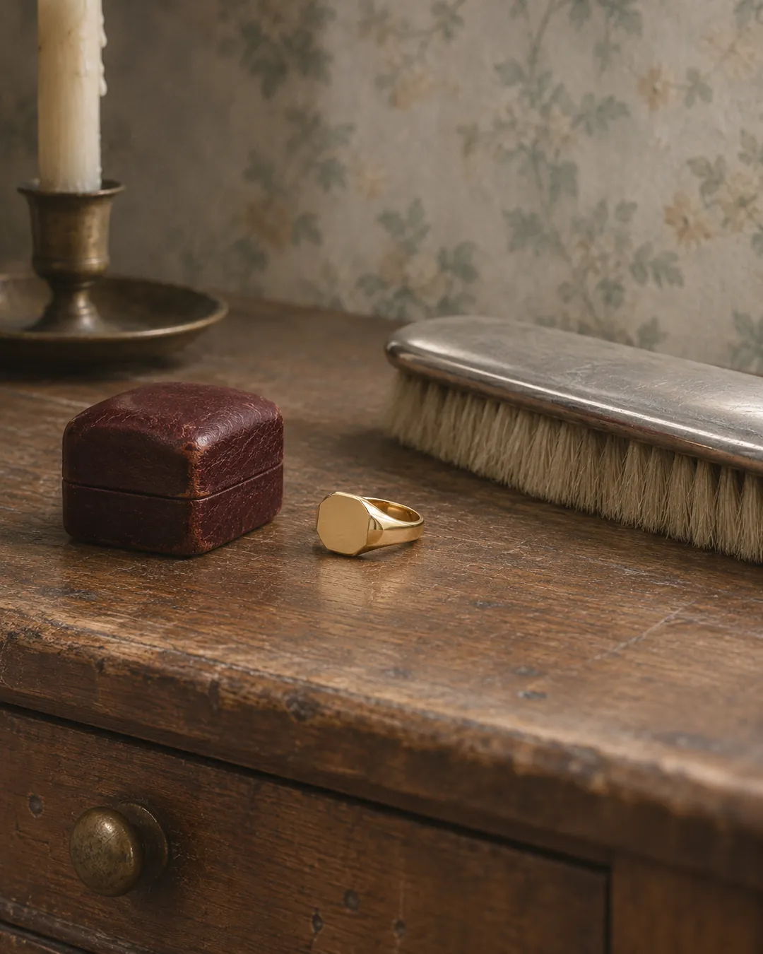
- The Keep is an octagon, also for initials. It gives a single letter or a stacked pair a strong, compact frame.
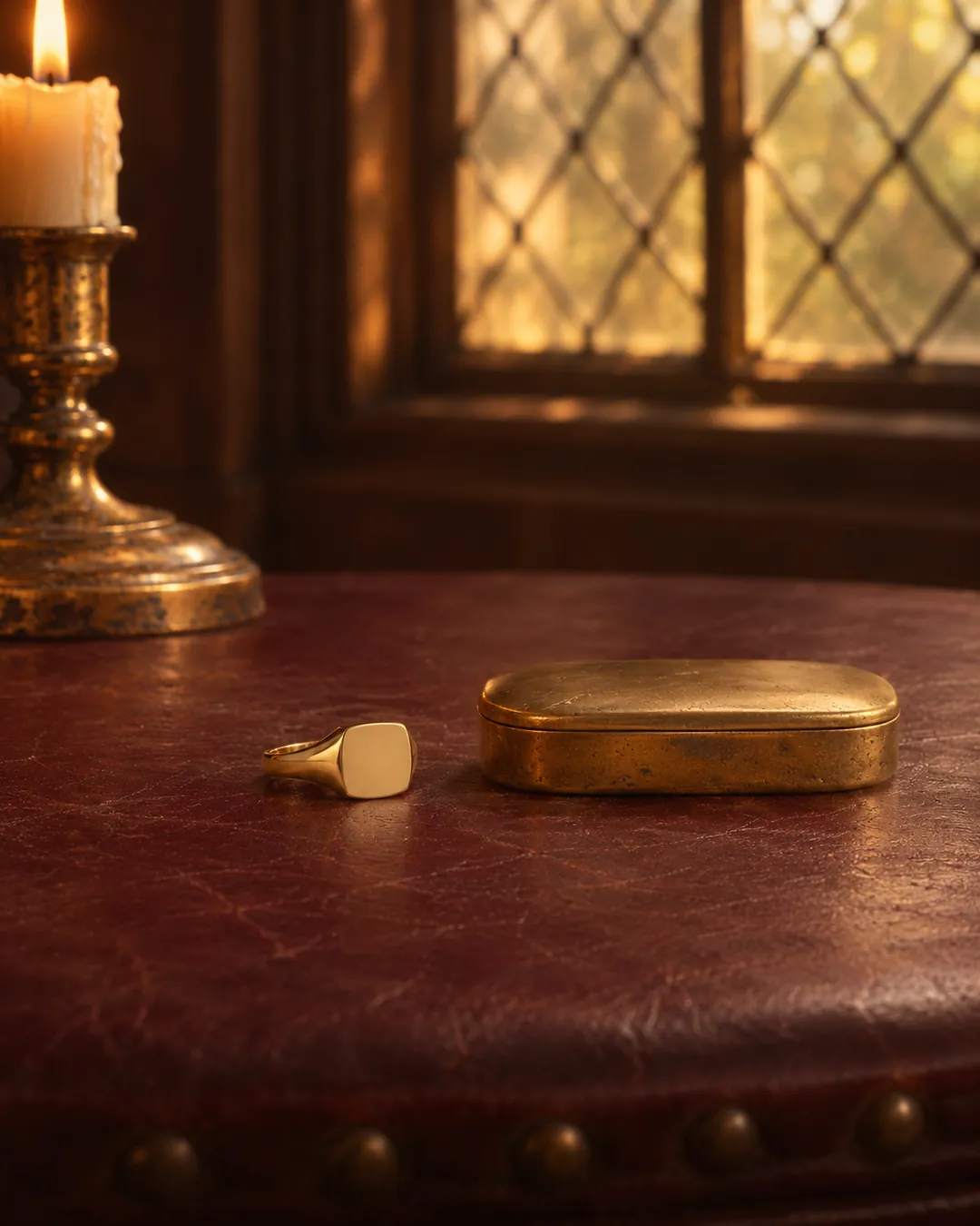
- The Abbey is a soft square. A single initial or an interlocked pair sits well in it.
- The Accord is a square, which is a natural home for a symmetrical, centered monogram.
- The Bastion is a hexagon, made for an emblem. If you'd like your letters worked into a small badge-like design, this is the one to look at.
- The Bequest is a classic oval, made for a crest. If you want a crest and your initials, it's worth seeing how they might share a design.
A simple way to match letters to shape: wide shapes suit side-by-side letters, tall or square shapes suit stacked or single letters, and anything with corners suits a centered, symmetrical layout. Choose the shape that mirrors the proportions of your letters and the design nearly draws itself.
If you're torn between a crest and a monogram, there's a plain rule. A crest tells people where you come from. A monogram tells them who you are. Some people choose one for a first ring and the other for a second. Our guide to heraldry symbols explained gives you the vocabulary if you go the crest route.
What to Check Before You Buy
Sizing comes first. Crest rings come in US sizes 5 to 13.5. Measure the exact finger you'll wear it on, and do it at the end of the day when your hands are warm, because fingers are at their largest then. A signet sits best a little snug, since the face is heavier than a plain band and a loose ring will spin until the letters face the floor. If you land between two sizes, choose the larger. Size is final once you approve your proof, so don't guess.
The proof is your safety net. Nothing is cast until you approve a proof. That's your chance to check the spelling of the letters, the order, the spacing and the overall look. Read it the way a stranger would. Can you tell what the letters are from an arm's length away? Is any letter crowded against the border? Does the largest letter look right in the center? Once you approve, the ring is final sale, so take the proof seriously and don't rush it. The details are on our FAQ page.
Decide whether you'll press wax. If a wax seal is part of the plan, ask for the Deep seal face before you order: it is made for pressing wax, and we'll quote it for you. It's cut deep and in reverse so the impression reads correctly in the wax. A face designed for wear is read correctly on the finger, so say which you want at the start. The history of the practice is covered in the Wikipedia article on sealing wax.
Think about the hand and finger. The traditional finger is the little finger of the hand you don't write with. The ring finger is also traditional, and the index finger is common today. This affects your size as well as how the ring sits, since the little finger is smaller than the others, so measure the finger you'll actually use.
Each ring is numbered. Every ring has a Register number laser-engraved inside the band. It's a small detail you'll only see when you take the ring off, and it ties the ring to the Register.
Plan the care. Gold is a soft metal, and a face that's worn daily will pick up fine marks and a gentle patina over the years. That's part of the character of a signet. A soft cloth and mild soap keep it bright, and the care page has the details. Take it off for heavy manual work, machinery and anything that could snag it, because any ring can catch.
Tips from the Experts
Here's the practical advice that comes up in the monogram and seal-engraving tradition, plus a few plain design rules.
Sketch before you submit. Write your letters on paper in a few sizes and arrangements. Then hold the page at arm's length. The versions that still read clearly are the ones worth putting on gold.
Use capitals. Capital letters are the norm on monogram rings, and for good reason: they're consistent in height, they have strong shapes and they sit tidily inside a border. Lowercase letters can look charming in a script, but capitals are the safer choice for clarity.
Choose fewer elements. Letters plus a border is a complete design. Letters plus a border plus a flourish plus a date is usually one thing too many. Gold is rich enough that a quiet face looks luxurious.
Be consistent about the order. If you're giving the ring as a gift, confirm the order of the initials with someone who knows the full name. A swapped middle and last initial is easy to miss and hard to un-see.
Think about a family set. A shared design across several rings can work well. Matching letterforms in different initials give a family a common look without making the rings identical.
Match the letters to your life. If you wear a ring daily, a heavier letter with a thick border will stay legible as the surface softens with wear. If it's for occasions, you can afford a finer design.
Look at the whole range first. Start at the Crest Signet Rings home page or the journal for background, then browse the full set of signet rings and picture your letters in each shape before you decide.
FAQ
What is the best monogram signet ring?
The best one is the one where the letters are easy to read and the face shape suits them. A wide face like the Chancery suits two or three initials, while a compact shape like the Keep or the Abbey suits a single letter. Pick the proportions first, then the metal tone you'll enjoy wearing.
How do I know which monogram is right for me?
Write your initials in a few layouts on paper and look at them from arm's length. If you like the classic look, use three letters with the surname initial larger in the center. If you want something cleaner, one bold initial or a stacked pair is hard to beat.
What should I look for when buying one?
Look for clear letters with space around them, a face shape that matches the layout and a size measured on the exact finger at the end of the day. A signet sits best a little snug, and between sizes you should choose the larger. If you plan to press wax, ask for the Deep seal face before you order.
What happens once I approve my proof?
Nothing is cast until you approve the proof, so that's the moment to check the letters, order, spacing and size. After approval your ring is made to order and becomes final sale, including the size. Faults are covered by warranty, and the FAQ page has the full details.
References & Sources
Every signet is made to order, and nothing is cast until you approve your proof.
See the signet rings